On the DC Universe: The Source blog yesterday, they unveiled the logo for the upcoming The Fury of Firestorm series! Click the logo below to enlarge.
I love this new logo! The notches in the thick block letters and the hypnotic circles look fantastic. If you keep staring at the circles, you’d swear they are moving or three-dimensional.
I figured this was a good opportunity to display all the various Firestorm logos over the years. I’ve been meaning to post these for ages, today just gave me an excuse.
Below is the original Firestorm logo that appeared on Firestorm vol 1 #1-5.
It still appears on merchandise from time to time.
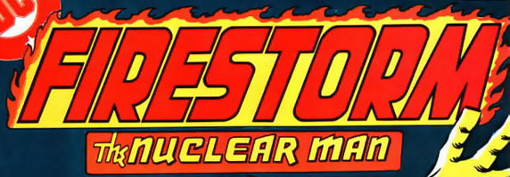
The logo below appeared on The Fury of Firestorm vol 2 #1-12
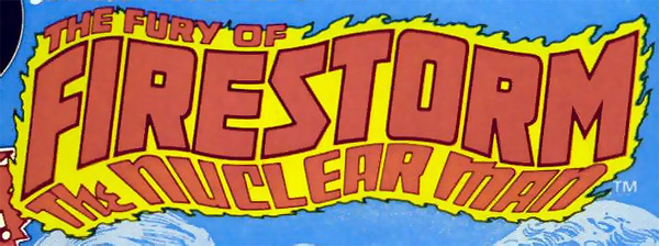
The logo below appeared on The Fury of Firestorm vol 2 #13-49.
For me, this is the classic Fury of Firestorm logo.

The logo below appeared on The Fury of Firestorm vol 2 #50-54. This logo was pretty much despised by everyone and was quickly replaced. From issue #50-64, DC seemed uncertain what logo they wanted to go with for this book.
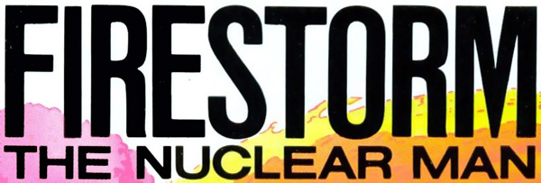
The logo below, really just a stripped-down version of an earlier logo,
appeared on The Fury of Firestorm vol 2 #55-58, and 64

The logo below appeared on The Fury of Firestorm vol 2 #59-63

The logo below appeared on Firestorm The Nuclear Man vol 2 #65-82.
This was the basic design for the logo throughout the “Blank Slate” era.
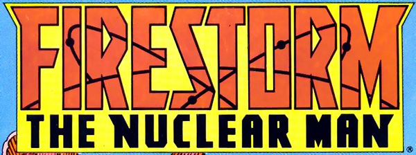
The logo below appeared on Firestorm The Nuclear Man vol 2 #83-85

The hideous logo below appeared on Firestorm The Nuclear Man vol 2 #86.
They basically took the logo above and broke each letter apart,
and set them on fire. Thankfully it lasted exactly one issue.
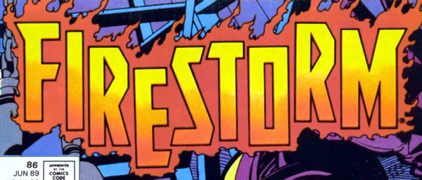
The logo below appeared on Firestorm The Nuclear Man vol 2 #87-88.
I love this logo. Really gorgeous and conveyed the new spirit of the book
as the Elemental Firestorm took over.
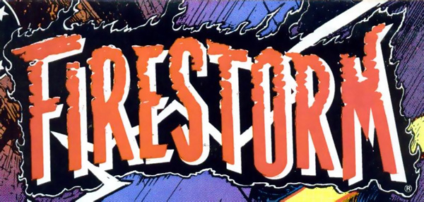
The logo below appeared on Firestorm vol 2 #89-100
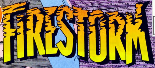
The logo below appeared on Firestorm vol 3 #1-22.
This was the first Jason Rusch Firestorm logo.
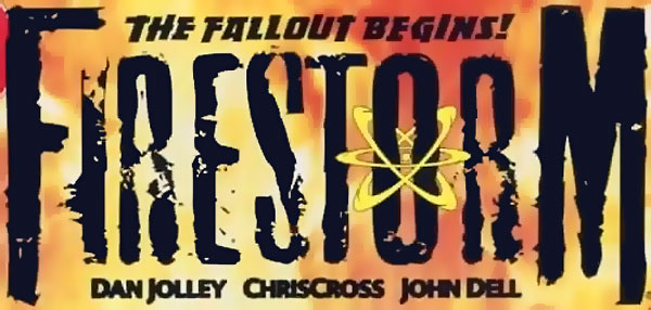
The logo below appeared on Firestorm The Nuclear Man vol 3 #23-35
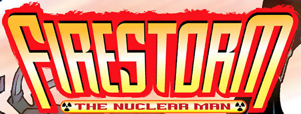
There you have it! All the Firestorm logos. Which is your favorite?
My thanks to Joe Slab from The Aquaman Shrine for the heads-up about the new logo!
Support Firestorm! Fan the flame!

I’m wondering if the tunnel effect on the new logo is significant.
I think my favorite of all of them is the one that ran from issues 83-85. Although the one right before it is pretty cool, too.
My favorite is the wavy logo from vol2 #1-12. Those were the comics that got me hooked on Firestorm after following him to his own series from the Flash comic backups.
“The logo below appeared on The Fury of Firestorm vol 2 #13-49. For me, this is the classic Fury of Firestorm logo.”
Hands down–for me–this logo is the best too. Similiar to the previous ones, different enough to stand out.
Man, lots of logos changes over the years. Didn’t think it was this many.
About the new one, I like it. Feels post-modern-ish. A bit of computer techish. Maybe it will stay around for a while.
Spinks
It reminds me of the aesthetic of the Tangent event books, which I thought looked great. Kind of retro Eurocentric vibe. I never cared for that first ’70s logo, but it isn’t objectively bad, and Firestorm seems to have had consistently solid logos. I especially like the stark logo from 55-58 and the two from Vol. II.
Frank – Good call on the similarities with the Tangent logos! I’ve been having a hard time putting my finger on it, and that’s exactly it! This certainly isn’t a bad thing, just an observation.
My thanks to everyone for the comments!
I liked the Jason Rusch logo, but hated the nuclear symbol – it just looked like an after thought to the design.
The latest one is easily the best – looking forward to the new series!
I agree that the latest one is the best one.
I hope the current logo survives the upcoming reboot on the book.
[…] I really dig this Firestorm logo! It graced the covers of The Fury of Firestorm vol 2 #1-12 from 1982-1983. Personally, I refer to this logo as the “wavy logo”. For complete review of Firestorm logos, check out this post from a couple years ago. […]
Didn’t know the top logo hit the blogosphere. I designed it, so thanks for the input and posting it!