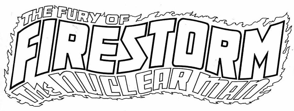
Todd Klein presented one of Firestorm’s classic logos on Facebook last week! Todd has a feature he calls “Logo of the Day” where he spotlights the original line work for a comic book logo and credits the designer. If you’re unfamiliar with Todd Klein, he’s a seasoned comics professional probably best known for his logo designs and his lettering of zillions of DC comics. Below is what Todd posted on Facebook. Click the image to enlarge!
Logo of the Day #414: THE FURY OF FIRESTORM designed by Gaspar Saladino for the first issue cover-dated June, 1982.”
The logo designer Gaspar Saladino created tons of comic logos for both DC and Marvel! Check out this post on Dial “B” for Blog for many examples!
I really dig this Firestorm logo! It graced the covers of The Fury of Firestorm vol 2 #1-12 from 1982-1983. Personally, I refer to this logo as the “wavy logo”. For complete review of Firestorm logos, check out this post from a couple years ago.
My thanks to Match-head John Heaton for sending this my way! Thanks, John!
Support Firestorm (and Todd Klein)! Fan the flame!


That, to me, is the classic – never bettered!
THAT’S THE LOGO!
The one that struck me when I saw it on the newsstands back in ’82.
Was really disappointed when they went to the “straight” logo.
I thought they were going to do something similar with the New52 book but I guess not.
-L.
Hey, thanks for the shout-out! Like Martin and Loran, I consider this is the definitive Firestorm logo. And it’s kind of interesting that we all think so, given that it served as the logo for only the first 12 issues of the series!
Never liked the font, but the design as a whole works well.
Sweet pin-up:
http://garnabiuth.deviantart.com/art/Firestorm-Color-123165649?q=sort%3Atime%20gallery%3Agarnabiuth&qo=326
Todd Klein rocks