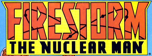
Todd Klein’s recently interviewed Steven Bové, artist and graphic designer. Mr. Bové was the man who designed the Firestorm The Nuclear Man comic logo during the “Blank Slate” era.

Be sure to visit Todd Klein’s blog for more information and Mr. Bové’s thoughts on this design. It’s a great read!
My thanks to our good buddy Walter, from the outstanding Boosterrific blog, for providing a heads-up about this interview! Thanks, Walter!
Support Firestorm! Fan the flame!


Wow, Shag! You sure do ferret out some of the nitty gritty of the character’s history.
I loved this version of the logo. I’m a little surprised that it doesn’t seem to have involved what I had assumed was the basis for it— that the block lettering suggested the strong, vaguely menacing lettering of the Russian alphabet in old Soviet propaganda. The words were English, but the style was Soviet— suggesting the new Cold War take on the character.
I definitely think that the modern-day issue of nuclear proliferation— not among two block superpowers but among any and all nations, in good standing or rogue— is something the current series has gotten right.
Also, the shape of the top of the logo sort of reflect the cheek-pieces of blank-slate Firestorm’s cowl moving diagonally away from each other to make a wider, flat top.